
NOTA

Background: Our Idea

Background
Nota was born from the frustration of losing those brilliant, fleeting ideas that come to you in the shower, at the store, or during your daily hustle—moments when there’s no pen or paper in sight. We wanted to create a tool that not only lets you capture those thoughts effortlessly with your voice but also uses AI to help you expand, organize, and refine them into something even greater.
Nota was created to help users capture fleeting ideas that often slip away in everyday moments. With voice input and AI-driven tools, it allows users to effortlessly record, organize, and refine their thoughts into something even greater, making sure those brilliant ideas never get lost.

Anna, a tech-savvy but busy 31-year-old office manager, struggles to fully utilize her phone for organization. She seeks intuitive, user-friendly tools to manage her ideas and reminders without a steep learning curve. Overwhelmed by complex apps, she prefers simple, efficient solutions that help her stay productive without being glued to her phone."

We identified five key user needs for voice-to-note AI: speed, accuracy, security, organization, automation, and privacy. Users seek voice commands, multi-language support, calendar integration, and seamless organization. Meeting these needs ensures efficiency, security, and user trust.
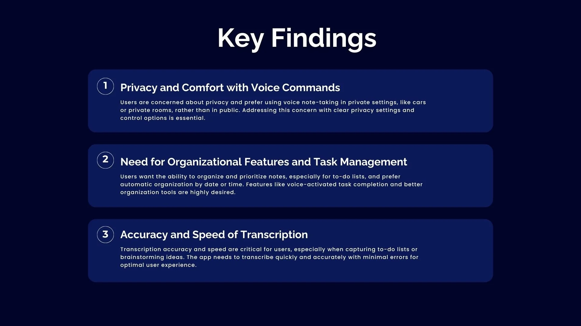
Key findings highlight user needs for privacy in voice commands, better task organization, and fast, accurate transcription. Users prefer private settings, seek automated note organization for to-do lists, and need error-free, real-time transcription for an optimal experience.

Our survey found that users need fast, accurate voice-to-text, with a focus on privacy, organization, and transcription accuracy. They use these apps while multitasking but worry about privacy, accuracy, and ease of use. Key features desired include auto-saving, categorization, and seamless organization.
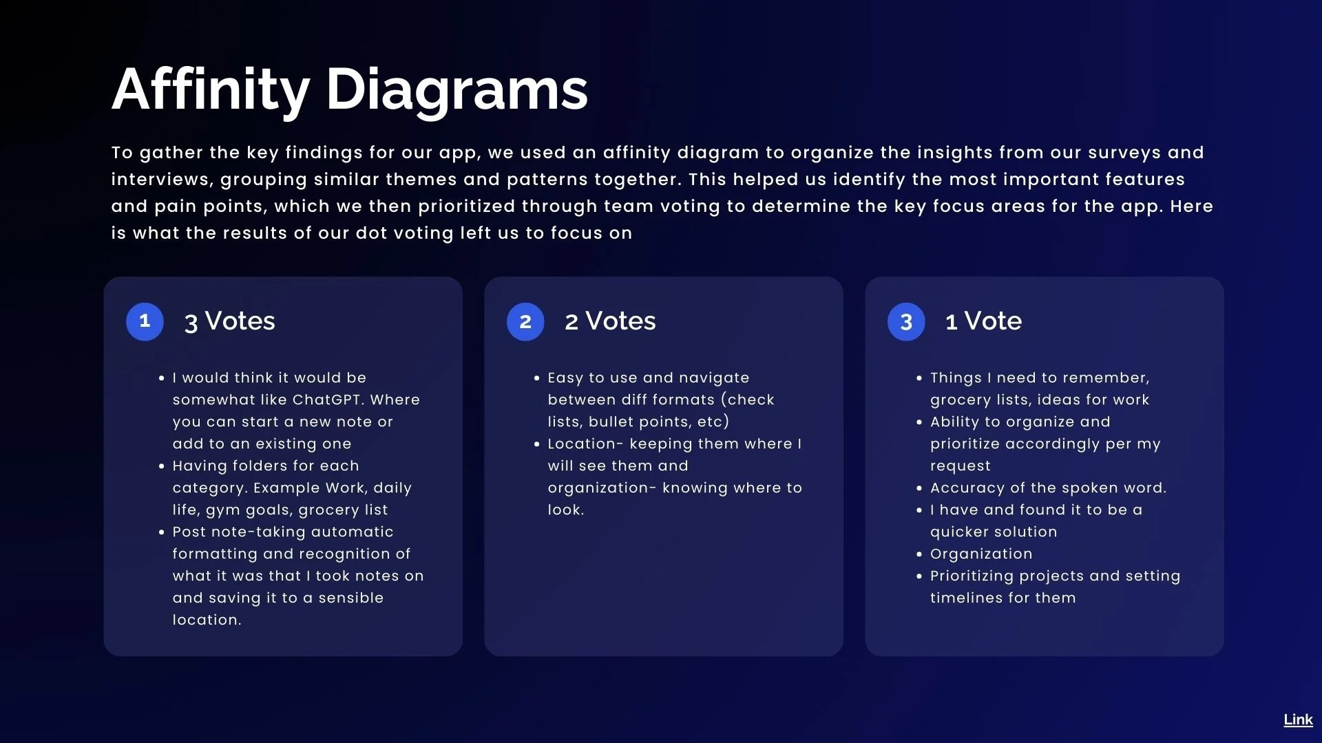
We used affinity diagrams to prioritize features, highlighting a ChatGPT-like note system, folder organization, and auto-formatting. Users also value easy navigation, structured organization, and quick access, shaping an intuitive and efficient note-taking experience.

To gain a deeper understanding of our users, we created an empathy map. This helped us explore their thoughts, feelings, and challenges when it comes to note-taking. Through this process, we identified key concerns, like the need for an accurate way to capture grocery lists or work ideas, and doubts about whether the app would truly understand them.


Meet Shelly—our user persona, representing the average person on the go.
By shifting our focus from busy professionals to everyday users like Shelly, we’re designing an app that truly fits into real-life routines—making note-taking effortless, reliable, and accessible for anyone on the move.

For busy individuals, fleeting thoughts often feel like missed opportunities. Nota offers a seamless, hands-free solution to capture ideas in the moment, helping users stay organized and reduce stress without interrupting their flow

Busy individuals often struggle to capture and organize their thoughts while multitasking. Traditional note-taking methods are either too manual or fail to accurately convert spoken ideas into structured, searchable notes.
We believe that by providing an effortless voice-to-note transcription feature, Nota will help users capture and organize their thoughts seamlessly, without interrupting their daily activities.

Our AI-powered, voice-first app helps busy individuals capture, organize, and share ideas easily with real-time transcription, smart categorization, and seamless collaboration. Unlike other apps, it’s fully voice-activated, turning scattered thoughts into actionable insights and boosting productivity.

The user journey map outlines the key steps a user takes with Nota, starting from discovering the app through social media or ads. After visiting the website and reading reviews, they download the app and experience its ease of use during onboarding. As they use the app, follow-up emails and in-app notifications introduce additional features.

During our brainstorming session, we focused on identifying and prioritizing key features for the Nota app. We discussed essential functionalities like AI-driven note organization, voice recognition accuracy, and cross-device accessibility, ensuring the app would be fast, intuitive, and user-friendly.

In this brainstorming session, we explored what users like, wish for, and wonder about in Nota. We discussed the strengths of the app, such as its voice command functionality and automatic note categorization, while also identifying opportunities for improvement.

Shelly is a graphic design manager juggling multiple creative projects, team management, and collaboration. She struggles to capture spontaneous ideas during busy moments like commutes or while multitasking. Nota addresses these challenges with hands-free, voice-activated note-taking, providing real-time feedback for accuracy and confidence.

Shelly, a busy mom, struggles with overwhelming tasks and stress. After confiding in a friend, she tries a voice note-taking app and quickly finds it simple and effective. With the app’s help, she stays organized, reduces mental overload, and regains control of her busy life.

Nota’s information architecture begins with a simple sign-up and onboarding process. After onboarding, users land on the home screen, where they can access, manage, and categorize their notes. The "In-Note" functionality allows for easy note creation, real-time editing, and seamless syncing across devices.

The user flow in Nota starts with a straightforward sign-up and onboarding process, introducing users to key features like voice-activated note-taking and smart organization. From the home screen, users can easily create, edit, and categorize notes, with real-time syncing across devices.

These early sketches showcase key interface designs for the voice-to-note app, emphasizing usability and functionality. They highlight user-friendly navigation, seamless voice-to-text conversion, and efficient note organization, all aimed at enhancing the overall user experience

These lo-fi concepts address key user struggles with effortless and organized note-taking. The wireframes showcase a landing page introducing Nota as a personal assistant for note-taking, followed by a home screen displaying categorized notes for easy access. The New Recording Screen features a minimal UI with a central microphone button for seamless voice input.


The layout was said to be clean and organized, with intuitive core features, but required some refinements. Some buttons were hard to notice, and the hierarchy could be improved for quicker access to key actions.

The style guide is inspired by principles of simplicity and clarity, aiming for a UI that avoids clutter and makes actions intuitive. A sleek, futuristic design aligns with the app's AI-driven features, providing a tech-forward feel.

The blue and black color palette creates a calming feel, with blue fostering trust. The black adds sophistication, while white space ensures a clean, elegant design. This combination provides strong contrast and a neutral backdrop, making it ideal for a productivity-focused app.

Raleway offers a modern, sophisticated aesthetic that enhances readability. Optimized for digital interfaces, Raleway is an ideal choice for headings in apps.

Poppins is a geometric sans-serif font optimized for on-screen readability.

To ensure accessibility, we use legible fonts at minimum size of 12pt for body text and maintain sufficient line spacing. We use plain language and test materials with screen readers and color contrast tools to improve usability for all users.

We chose the Remix Icon set for Nota due to its comprehensive collection of 2860 icons, offering versatility for various app features. By using a single icon set, we maintain a consistent experience without additional costs or licensing complications.

The logo features a minimalist, modern design that aligns with the sleek, user-friendly experience of the app.
The smooth, gradient-filled sphere symbolizes fluidity, sound waves, and seamless interaction, alluding to voice input.

A heuristic evaluation identified usability issues in the app's design, focusing on navigation, clarity, and feedback.
Key findings included unclear button labeling, lack of visual feedback during interactions, and the need for improved hierarchy to make actions quicker to find.

Our A/B testing focused on optimizing two areas based on user feedback.
For the animated blue recording indicator sphere, users preferred Version B, due to its calmer, more relaxed aesthetic.
Regarding the “Jump Back In” button, testers found it unclear and unnecessary, so we replaced it with a more intuitive “Today” button for easy access to daily notes and tasks.

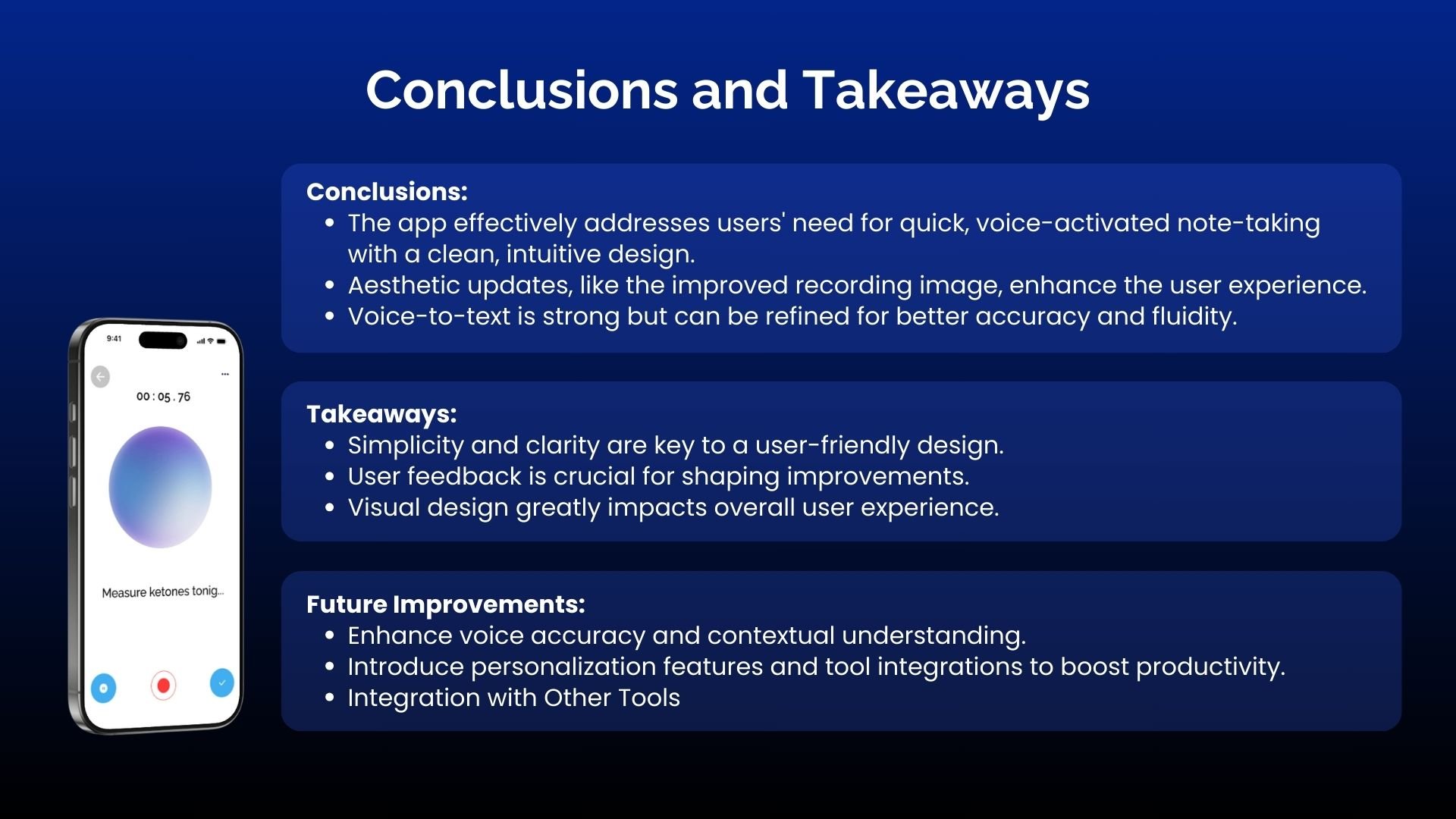
The app meets users’ needs with an efficient, voice-activated note-taking solution and a clean design. Recent updates, like the improved blue animated recording image, enhance its aesthetic appeal.
While voice-to-text is effective, there’s room for improvement in accuracy.
Future improvements will focus on refining voice accuracy, adding personalization, and integrating with other tools to boost productivity.
